Commission selects Safety Harbor Centennial logo(s)


Two has historically been considered better than one when it comes to everything from ark animals to baseball doubleheaders.
So perhaps it was with that adage in mind that the Safety Harbor City Commission elected to go with a pair of logos for its centennial celebration in 2017 instead of just one.
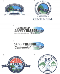
On Monday night, the five commissioners were asked to choose a design they liked best from a lineup of half a dozen logos, and after several minutes of discussion where no clear-cut favorite emerged, a compromise was eventually reached.
“Can I make a suggestion?” City Manager Matt Spoor asked.
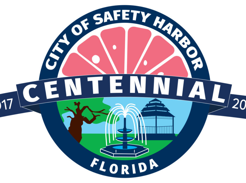
“When we look at the logo, it’s going to be on banners, it’s going to be on shirts, it’s going to be on marketing material that is colorful. And two is more like your proclamation and your letterhead. Five is more like your logo for marketing.”

“So you could use five for…your marketing, and then you could do number two for your proclamations and official documents.”
The compromise was necessary because the votes were split between a logo that’s more official and businesslike and one that’s a bit more fun and incorporated color, thanks to the inclusion of a grapefruit.
Commissioners Janet Hooper, Carlos Diaz and Cliff Merz all included the grapefruit logo, #5, in their selections, while Merz, Vice-Mayor Andy Zodrow and Mayor Andy Steingold voted for the variation of the city’s official seal, #2.
“I was a one and two guy,” Mayor Andy Steingold said, adding “I like two because it was consistent with one.”
But Commissioner Hooper, who choose #5 and #6, called the first two logos “too formal” and “boring”, and said she wanted to see some color in the logo.
“I actually do like the one that has the color in it, although the grapefruit is a little orange, and my preference would be a little more pink,” Hooper said.
“But it brings a lot of color in.”

After Spoor pointed out that Safety Harbor’s grapefruit festival could be returning to the city during the centennial year after a long absence, making the grapefruit design a logical choice, the commission agreed to utilize the two logos in 2017.
“I think remaining flexible is a good idea,” Commissioner Diaz said. “Because we may want to put some on envelopes, stationary, et cetera.”
“Very good,” Spoor said once the consensus was reached.
“We’ve got two centennial logos.”
Harborites, what are your thoughts on the city’s centennial logos? Which design do you prefer? Let us know in the comments below.


Is there a restriction for using the centennial logo for printed products?
Love the two logos selected! They epitomize Safety Harbor’s history! Looking forward to the celebration as I was raised in Safety Harbor and very proud of my home town!